library(naniar)
library(dplyr)3 Explore missing values
This book contains both practical guides on exploring missing data, as well as some of the deeper details of how naniar works to help you better explore your missing data. A large component of this book are the exercises that accompany each section in each chapter.
In previous sections, we learned what missing values are, how R deals with them in basic operations, and several ways (including with any_na and are_na) to perform a cursory check for missing values in our data. A critical next step in exploring missingness is to visualize missing values, which can reveal patterns of missingness across variables (columns) and cases (rows) in our data.
3.1 Explore “big picture” missingness
To start, recommend getting a “bird’s eye view” of missingness in the data. We can get started with a few big picture questions:
- Where, and how frequently, do missing values occur in the data overall?
- How often, and across what variables, do missing values co-occur?
- Are there notable patterns of missingness across groups?
We will approach these questions using using five functions from the naniar package:
vis_missto visualize whereNAexist in a data framen_missfor overall frequency ofNAprop_missfor the proportion of values in the data that areNAgg_miss_upsetto visualize overall co-occurrence of missingnessgg_miss_fctfor a heatmap of missingness across variables, by groups
Note that not all of these functions are for visualisation.
3.1.1 vis_miss to visualize locations of missing values
When you first get a dataset, it can be difficult to get a visceral sense of where missing values are. To get an overview of the prevalence and patterns of missingness in the data, use the vis_miss function. This function is in naniar and is exported from the visdat package.
For example, with the built-in airquality dataset:
vis_miss(airquality)Warning: `gather_()` was deprecated in tidyr 1.2.0.
Please use `gather()` instead.
This warning is displayed once every 8 hours.
Call `lifecycle::last_lifecycle_warnings()` to see where this warning was generated.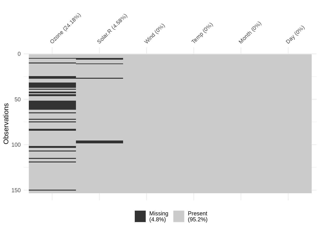
The vis_miss function produces an out-of-the-box binary heatmap of missing values, where each “cell” in the heatmap corresponds to an element in the original data. In other words, we can think of the heatmap as a “spreadsheet” of the original data, where values have been replaced with one of two colors: black cells to indicate missing values, and gray cells to indicate non-missing values.
vis_miss also provides useful summary statistics, showing the overall percentage of missingness in the legend (at bottom), and the amount of missings in each variable (alongside column labels). The function also allows for clustering of the missing data by setting cluster = TRUE: this orders the rows by missingness to identify common co-occurrences.
vis_miss(airquality, cluster = TRUE)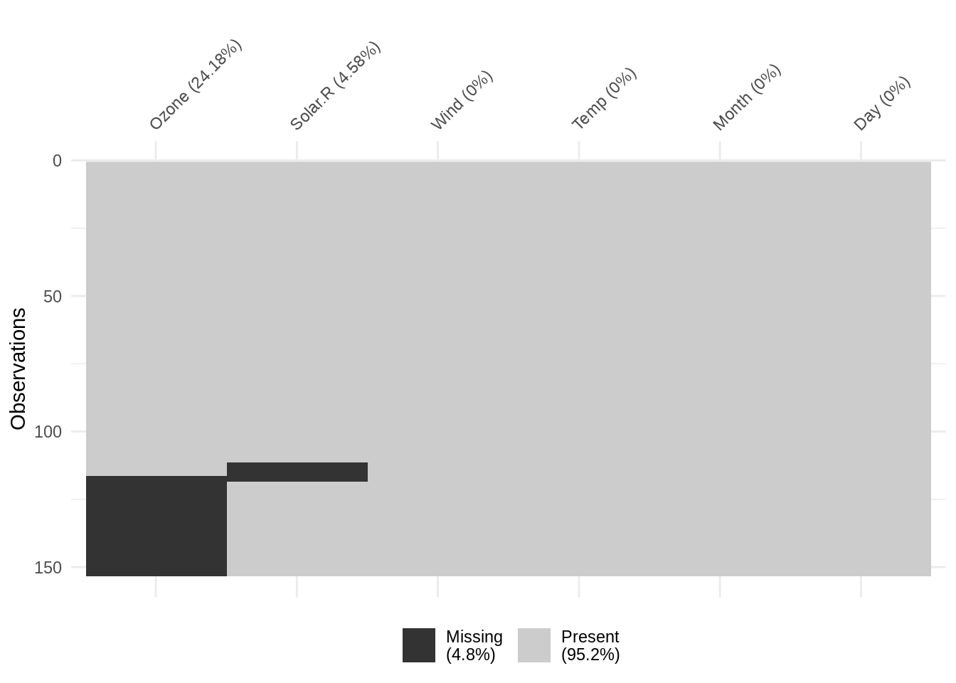
What can we learn from the vis_miss output?
From the vis_miss output, we can consider big picture questions about missingness prevalence and patterns. For example:
- Do missing values appear randomly distributed throughout the data, or are they clustered within several variables?
- Are there notable streaks of missingness within variable(s), and why might those exist?
Considering the visualization above for vis_miss(airquality). We might interpret the output as follows: Overall prevalence of missingness is low (4.8% missing), and there are only missing values in two variables: Ozone (24.8% missing) and Solar.R (4.58% missing). Missing values do not necessarily co-occur. There are several streaks of missingness (shown as black areas spanning adjacent cases), most notably in the Ozone variable from rows 52 - 61.
3.1.2 Overall counts and proportions of missing values
If we have a very small dataset, like the vector x shown below, we can locate and count missing values manually, by simply counting in our heads how many NA values there are.
x <- c(1, NA, 3, NA, NA, 5, 8)But this doesn’t scale. What if we had a vector of length 2,892? Or a 52 column \(\times\) 841,000 row data frame? It would be nigh-impossible to find and count all NA values.
Visualisation is great, but sometimes we just need a hard number, so you can say something like, “54% of the data is missing!”. Use n_miss and prop_miss for a quick quantitative summary of overall missingness. Both return a single value for the total count and proportion of missing values in the entire data frame.
The n_miss function returns the total count all values in the data that are NA:
n_miss(x)[1] 3The prop_miss function returns the proportion of missings, which gives important context: here, we see that 42.86% of values in the data are missing.
prop_miss(x)[1] 0.4285714The complements of n_miss and prop_miss are n_complete and prop_complete, which return the number and proportion of complete (non-missing) values, respectively.
n_complete(x)[1] 4prop_complete(x)[1] 0.5714286The examples above show how we can use n_miss, prop_miss, and their complements for a small vector (x). We can apply them similarly to the larger airquality data used in the vis_miss example above.
To find the total number of NA in airquality:
n_miss(airquality)[1] 44And for the proportion of NA in airquality:
prop_miss(airquality)[1] 0.04793028Which tells us that there are 44 total missing values in airquality, or 4.79%. Note that this total proportion of missingness matches the value reported from vis_miss.
That is much quicker, easier (and safer, and more reproducible!) than manually searching for and counting missing values, especially in larger data.
An Aside
Under the hood, n_miss(x) is computed as sum(is.na(x)), and prop_miss(x) is mean(is.na(x)). These are rather brief short hand functions - so you might ask why bother making them? I believe it is because there is actually a fair bit packed into these functions. sum(is.na(x)) works because the output of is.na(x) is logical, and you can add logicals together, as TRUE and FALSE are coerced to 1 and 0, respectively. Similarly, you can take the mean of logicals. However, as a new R user, I found this a bit magical and wasn’t able to remember the right way to do it. A nice consequence of more descriptive names, n_miss and prop_miss is that we can take the complement, so a user can use tab-complete to also find n_complete and prop_complete. These functions are implemented as sum(!is.na(x)) and prop(!is.na(x)), which again, I think can be a lot to remember, especially when first starting out with R. Descriptively naming these functions is an important part of how naniar is designed.
3.1.3 Co-occurrence of missing values
To visualise common combinations of missingness - for example, which variables and cases tend to be missing together - we can use gg_miss_upset to create an UpSet plot (Lex2014?). This powerful visualisation shows the frequency of unique combinations of missing value co-occurrence.
We create an UpSet plot like so:
gg_miss_upset(airquality)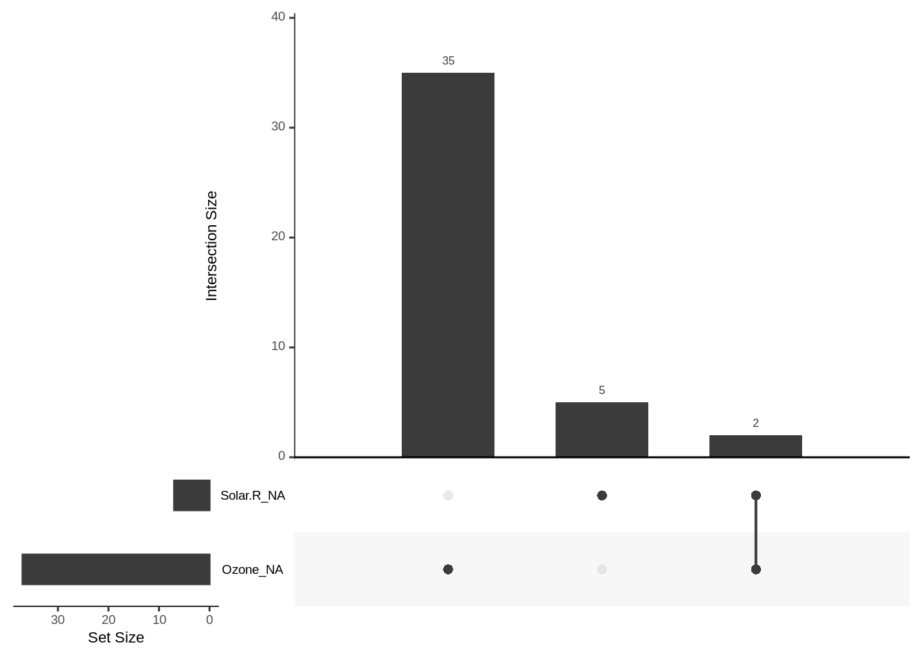
There is a lot going on, here are the main pieces:
- The vertical bars indicate the frequency of unique missingness combinations, indicated by the dots below each bar that correspond to variable names to their left
- The horizontal bars in the lower left indicate the total number of missing values for each variable
For example, let’s first consider the vertical bar of height 2 (on the far right), beneath which there are black dots next to both Solar.R_NA and Ozone_NA. That bar indicates that there are 2 cases (rows) in the data where exactly the Solar.R and Ozone variables contain NA.
The other two bars indicate that there are exactly 35 cases in which only the Ozone variable value is NA, and 5 cases in which only the Solar.R variable value is NA.
To summarize: gg_miss_upset creates an UpSet plot to visualize frequency of missing value combinations (co-occurrence) across variables.
3.1.4 Visualize missingness by factor level
To explore how missingness varies across factor levels within variables, use gg_miss_fct. Below we create a heatmap showing the prevalence of missingness across all variables in airquality, separated by each level in the Month variable:
gg_miss_fct(x = airquality, fct = Month)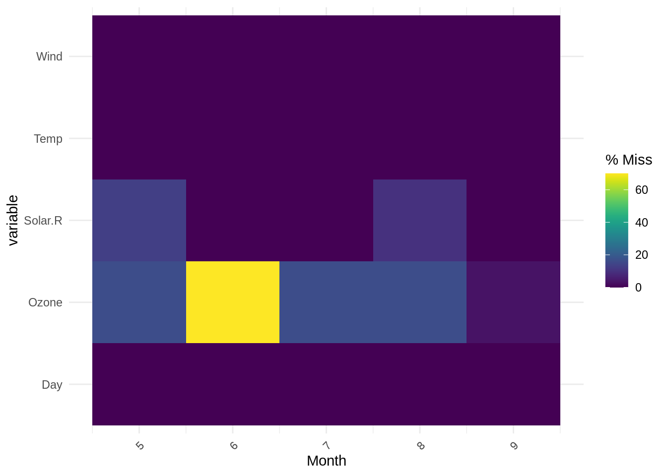
The output is a heatmap, with the x-axis showing the levels of the specified factors, and the y-axis showing other variables in the data, and colour showing the frequency of missingness (purple = lower missingness, yellow = higher missingness).
We see that the output of gg_miss_fct here, with each level of Month on the x-axis, clearly shows the highest proportion of missingness occurs for the Ozone variable in Month 6 (in agreement with previous summary outputs). Note: gg_miss_fct does not support facetting.
These “big picture” analyses or missingness are an essential starting point in exploration because they show us how much of the data is missing overall, and can reveal patterns in missingness (e.g. streaks, co-occurrence, and differences between factor levels). Next, it is important to further investigate how missingness occurs within variables (columns) and cases (rows).