ggplot(airquality,
       aes(x = Ozone,
           y = Solar.R)) +
  geom_point()
Warning: Removed 42 rows containing missing values (geom_point).
This book contains both practical guides on exploring missing data, as well as some of the deeper details of how naniar works to help you better explore your missing data. A large component of this book are the exercises that accompany each section in each chapter.
We have previously discussed the use of nabular data, a way to represent missing data alongside the data itself. This data structure underpins how naniar performs data visualisation and summaries. This chapter discusses how to use the nabular data structure with data visualisation to further explore why data could be missing, looking across two variables.
If you want to explore two variables in a dataset, a scatterplot is a natural graphic to show. Let’s explore ozone and solar radiation like so:
ggplot(airquality,
aes(x = Ozone,
y = Solar.R)) +
geom_point()Warning: Removed 42 rows containing missing values (geom_point).
However, note the warning message:
Warning message:
Removed 42 rows containing
missing values (geom_point).
What? What does this mean? Why would ggplot do this? Well, it turns out that it’s really nice that ggplot2 provides this warning, since removing missing values is often done in modelling and other graphics without you being made aware of it.
So, how do you visualise those missing values? How does visualising missingness make sense? This is the focus of this chapter.
ggplot(airquality,
       aes(x = Ozone,
           y = Solar.R)) +
  geom_point()
Warning: Removed 42 rows containing missing values (geom_point).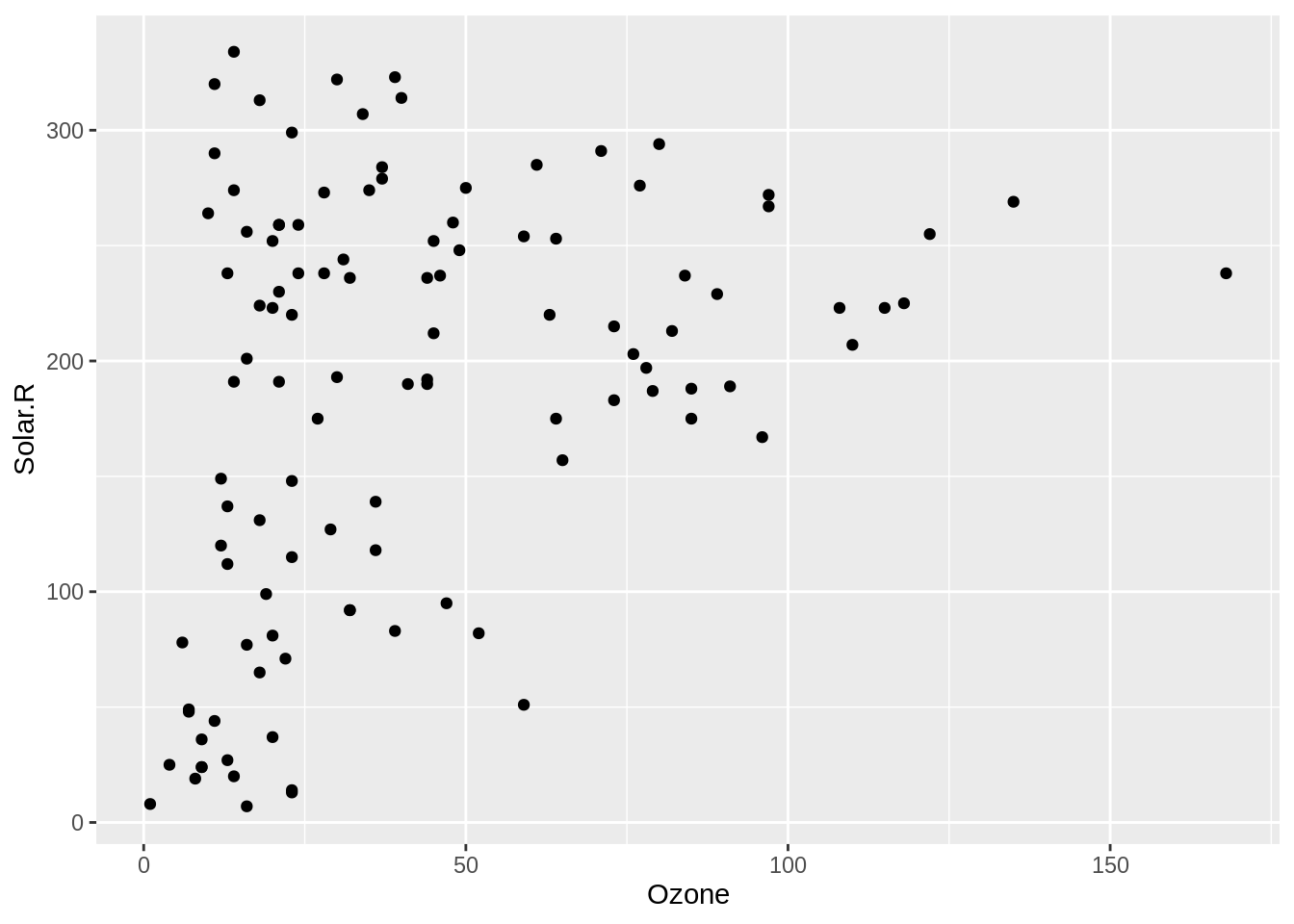
The problem with visualising a scatterplot when the data has missing values is that it removes any observations - entire rows - that have missing values. ggplot2 is actually very nice here and gives a warning that missing values are being dropped. The same cannot be said of other all functions in R!
geom_miss_point()gg_miss_point <- ggplot(airquality,
aes(x = Ozone,
y = Solar.R)) +
geom_miss_point()To explore the missings in a scatter plot, we can use geom_miss_point(). geom_miss_point() visualises the missing values by placing them in the margins.
airquality_rect <- airquality %>%
  as_tibble() %>%
  impute_below_at(.vars = c("Ozone", "Solar.R")) %>%
  summarise(xmin = min(Ozone) + min(Ozone)*0.1,
            xmax = 0,
            ymin = 0,
            ymax = max(Solar.R) + 10)

gg_miss_point +
  geom_rect(data = airquality_rect,
            inherit.aes=FALSE,
            aes(xmin=xmin, xmax=xmax,ymin=ymin,ymax=ymax),
            alpha = 0.4,
            fill = "orange")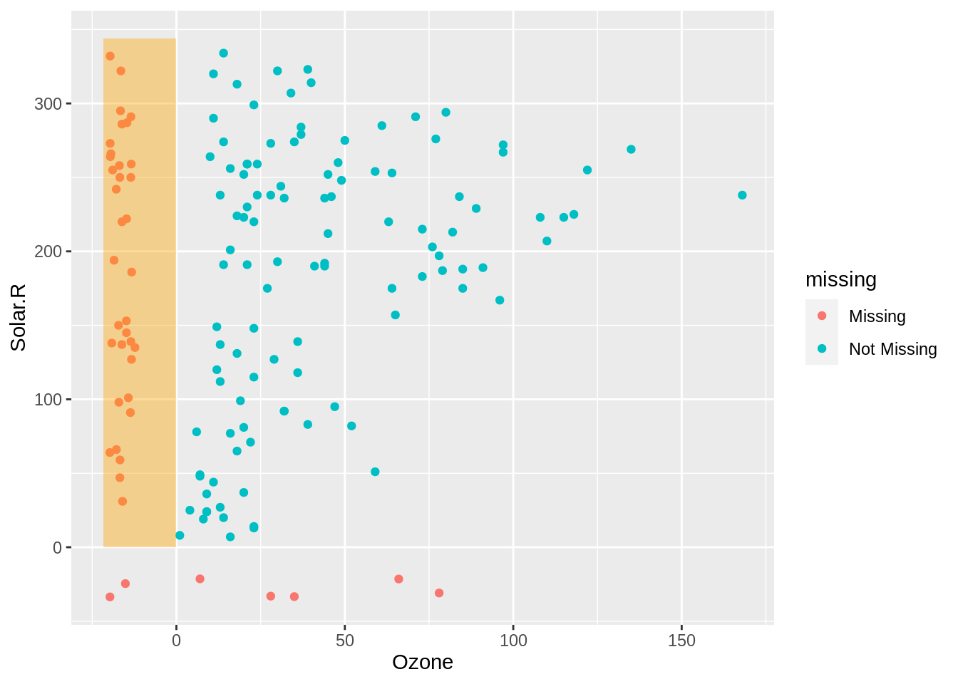
On the left in the highlighted orange section red we can see the values of solar radiation when ozone is missing. This shows us that the values of solar radiation are reasonably uniform.
airquality_rect <- airquality %>%
  as_tibble() %>%
  impute_below_at(.vars = c("Ozone", "Solar.R")) %>%
  summarise(xmin = 0,
            xmax = max(Ozone),
            ymin = min(Solar.R) - 10,
            ymax = 0)

gg_miss_point +
  geom_rect(data = airquality_rect,
            inherit.aes=FALSE,
            aes(xmin=xmin, xmax=xmax,ymin=ymin,ymax=ymax),
            alpha = 0.4,
            fill = "orange")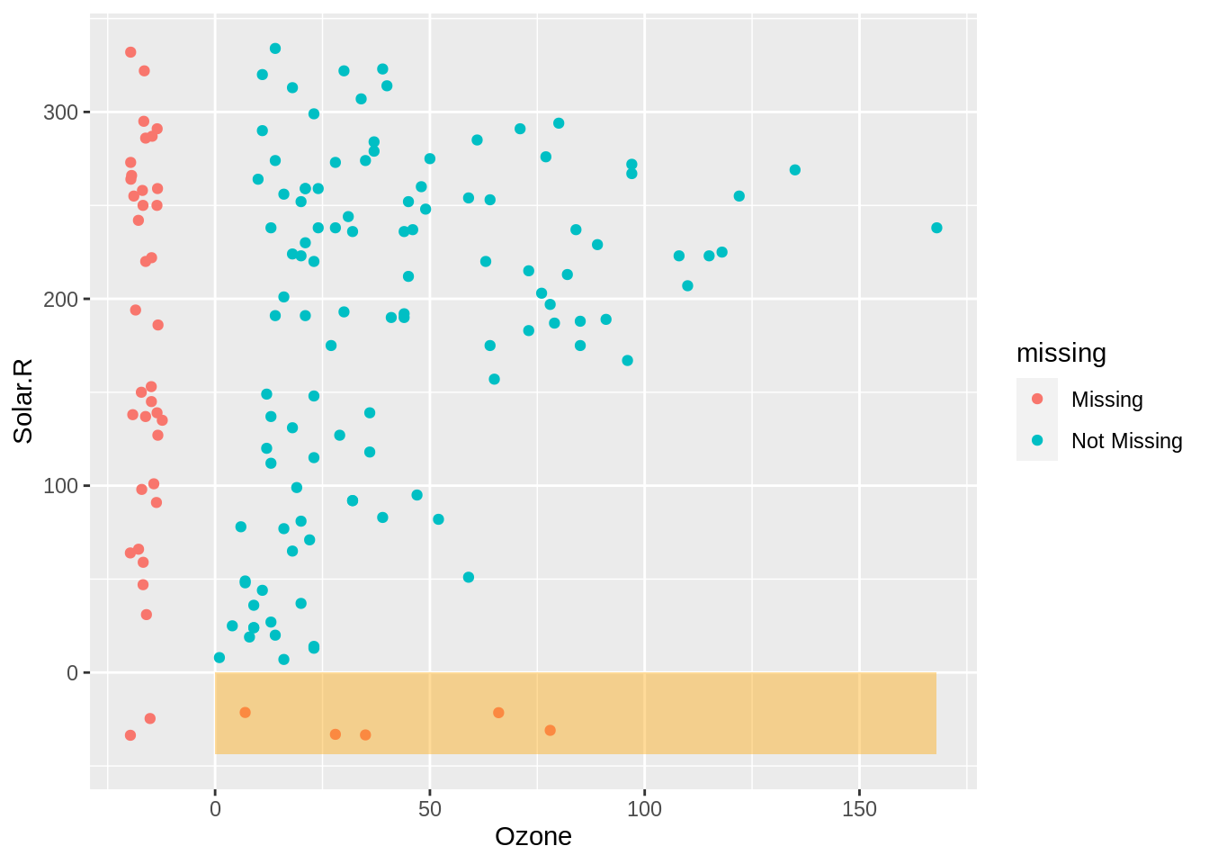
The values of ozone when Solar.R is missing are shown in red on the bottom, this shows us that the missing values tend to occur at lower values of ozone.
airquality_rect <- airquality %>%
  as_tibble() %>%
  impute_below_at(.vars = c("Ozone", "Solar.R")) %>%
  summarise(xmin = min(Ozone) - 10,
            xmax = 0,
            ymin = min(Solar.R) - 10,
            ymax = 0)

gg_miss_point +
  geom_rect(data = airquality_rect,
            inherit.aes=FALSE,
            aes(xmin=xmin, xmax=xmax,ymin=ymin,ymax=ymax),
            alpha = 0.4,
            fill = "orange")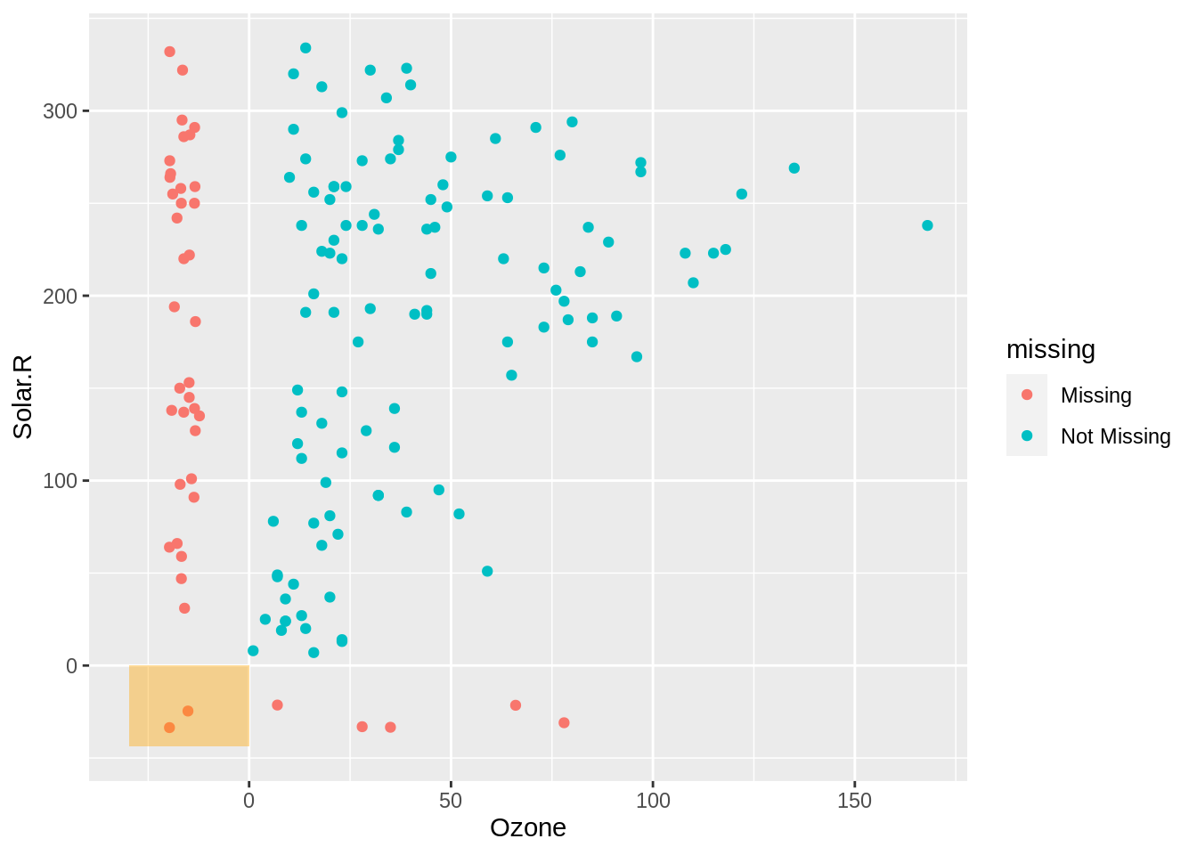
In the bottom left we show cases where there are missings in both ozone and solar radiation. To explain how and why this visualisation works, we are going to take a brief moment to unpack the data transformation that occurs here.
geom_miss_point performs a transformation on the data and actually imputes (fills in, replaces) the values that are missing. Under the hood, the data is represented like so, for the ozone data:
| Ozone | Ozone_shift | Ozone_NA |
|---|---|---|
| 41 | 41.00000 | !NA |
| 36 | 36.00000 | !NA |
| 12 | 12.00000 | !NA |
| 18 | 18.00000 | !NA |
| NA | -19.72321 | NA |
| 28 | 28.00000 | !NA |
Notice that we have our nabular data here - with Ozone and Ozone_NA. We also have a new column, Ozone_shift. This contains the imputed data. This data is imputed 10% below the minimum value of ozone. To keep track of which values were imputed, we can use the Ozone_NA column! We’ll come back to this idea of tracking missing values in the next chapter.
Because geom_miss_point() is a defined ggplot2 geometry, it behaves like any other ggplot. This means, you can use ggplot features like facets, to further explore your missing data. For example, you can facet by Month, to explore how the missingness changes over month:
ggplot(airquality,
       aes(x = Wind,
           y = Ozone)) +
  geom_miss_point() +
  facet_wrap(~Month)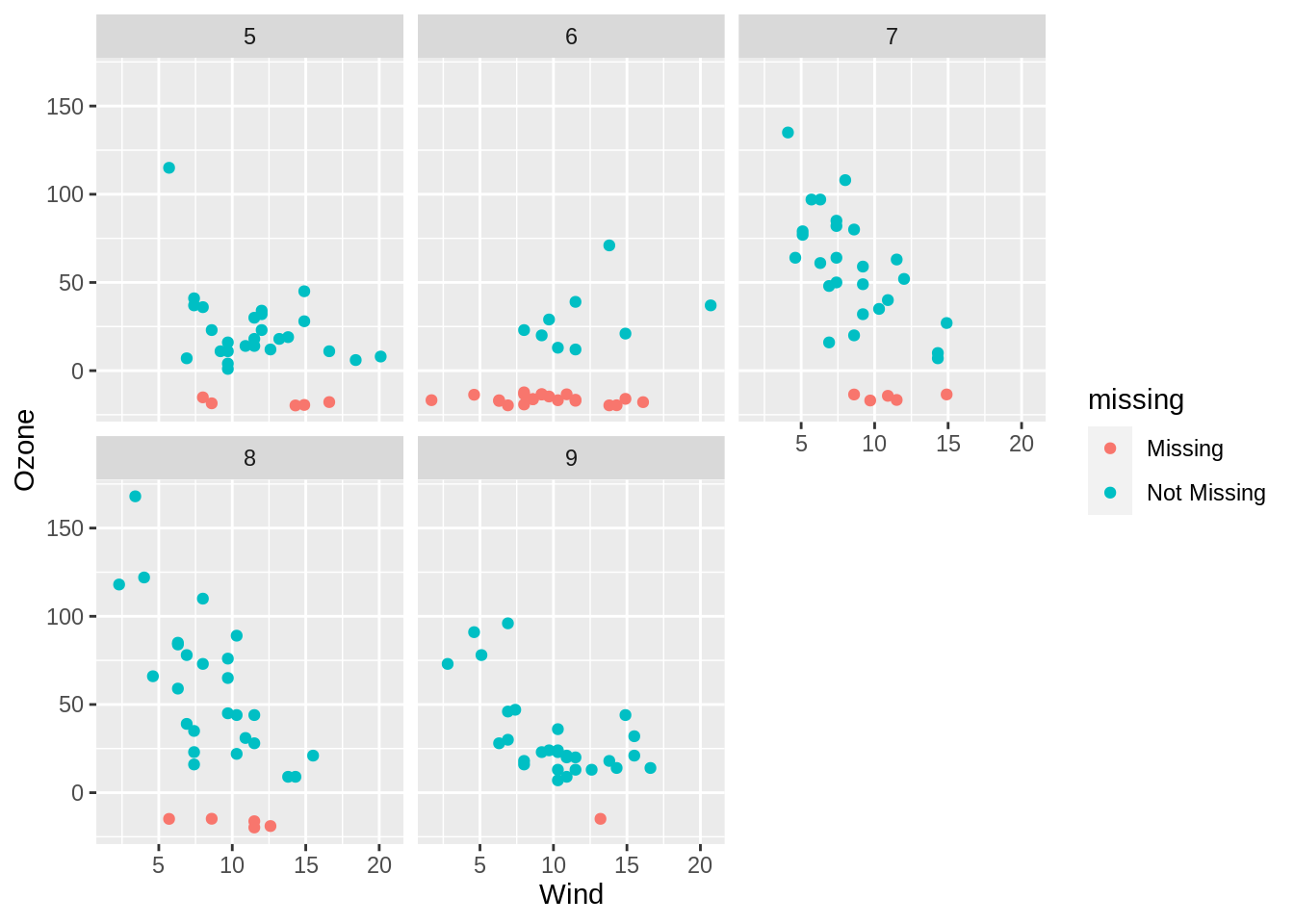
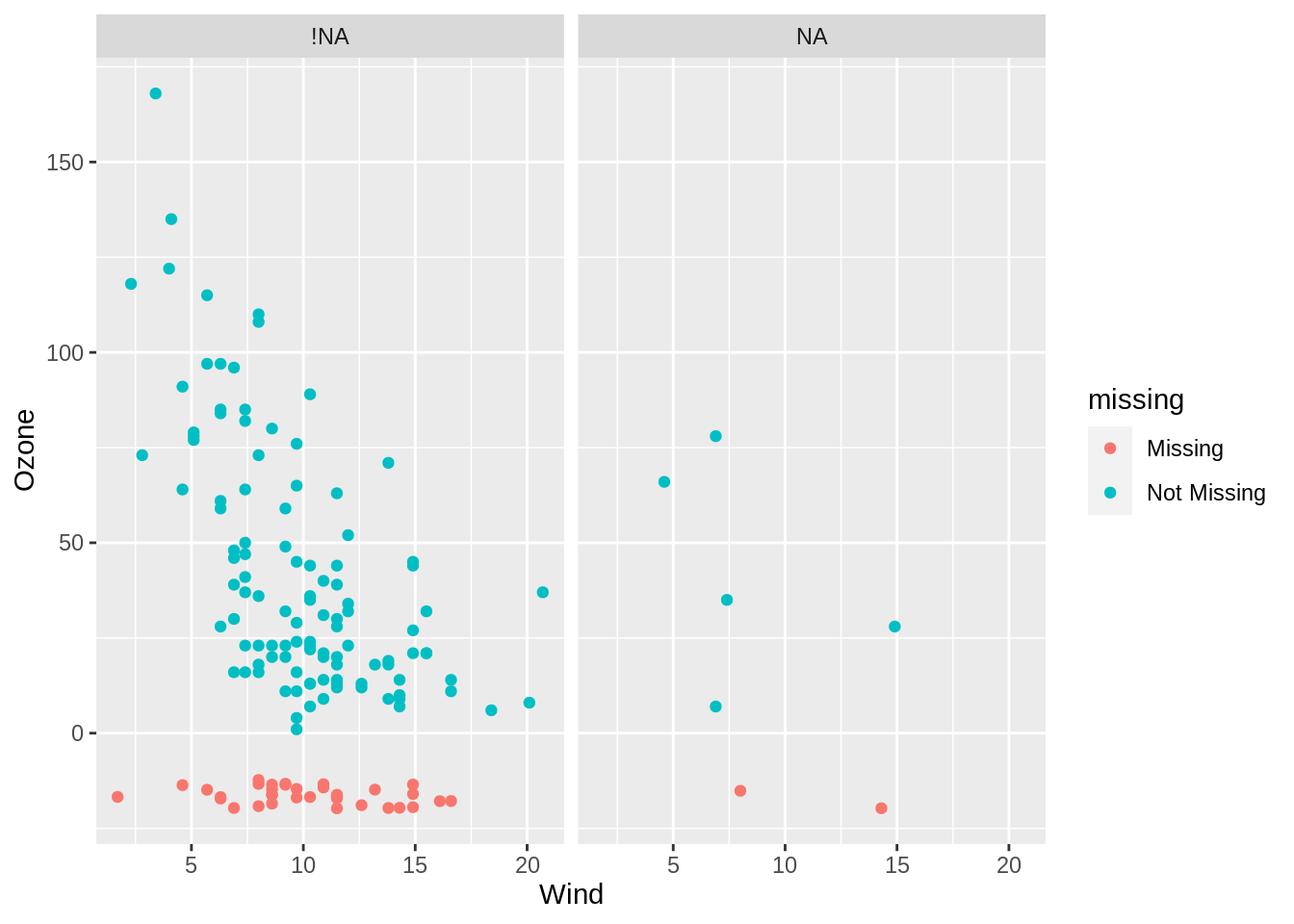
You can even use nabular data from the previous lesson, and explore the missingness by another variable being missing. For example, you can explore how the missingness changes when solar radiation is missing.
airquality %>%
  nabular() %>%
  ggplot(aes(x = Wind,
             y = Ozone)) +
    geom_miss_point() +
    facet_wrap(~Solar.R_NA)