This book contains both practical guides on exploring missing data, as well as some of the deeper details of how naniar works to help you better explore your missing data. A large component of this book are the exercises that accompany each section in each chapter.
Now that we’ve explored some ways to summarise data using nabular data, we are going to explore how you can use nabular data to explore how variables vary as other variables go missing. We’ll demonstrate this using ggplot, showing how to visualise densities, boxplots, and some ways of creating multiple plots, for each type of missingness.
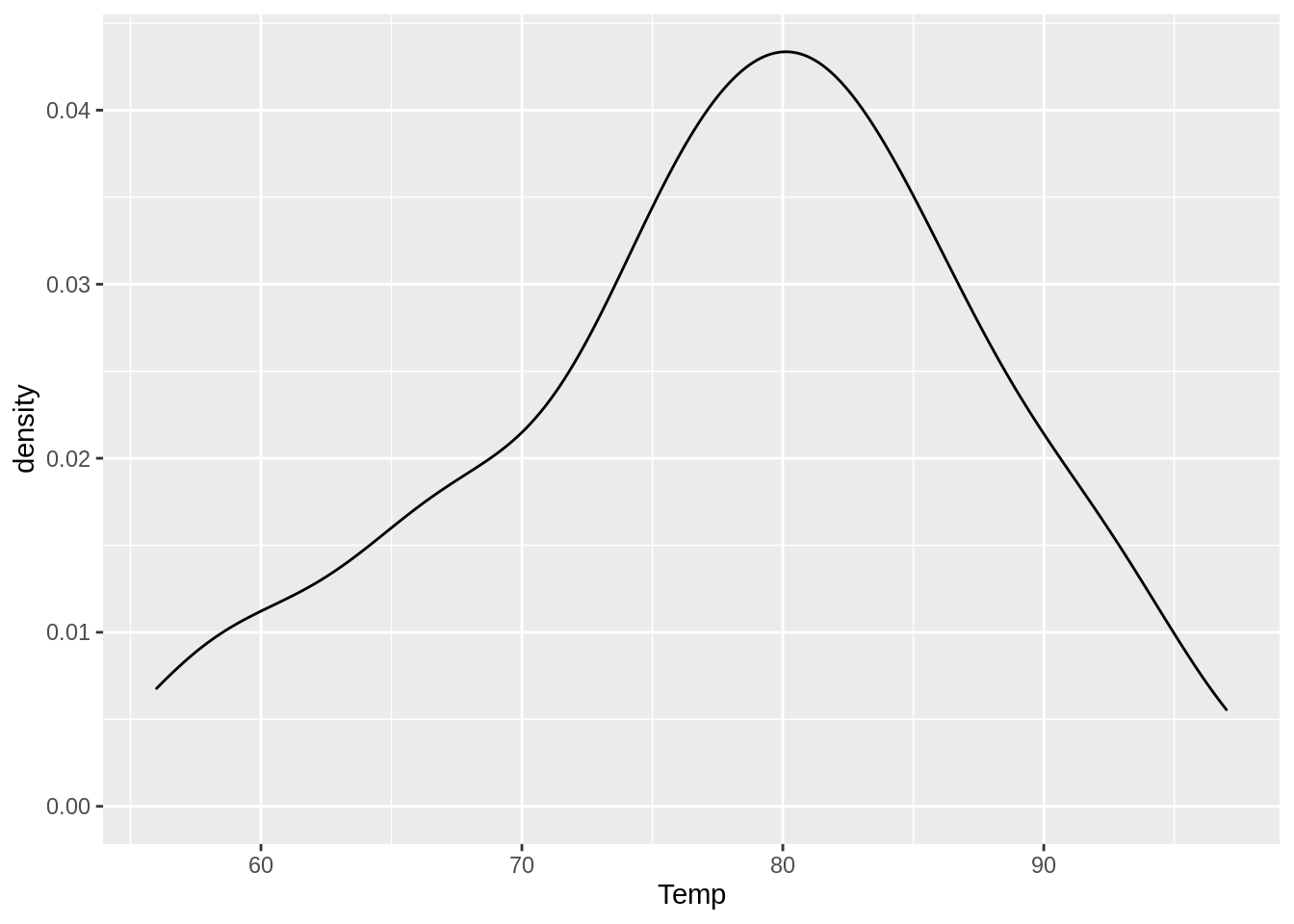
9.1 Visualizing missings using densities
To begin, we can look at the distribution of temperature using ggplot, placing Temp on the X axis, and then using geom_density() to visualise temperature as a density, or a distribution.
ggplot(airquality,aes(x = Temp)) +geom_density()
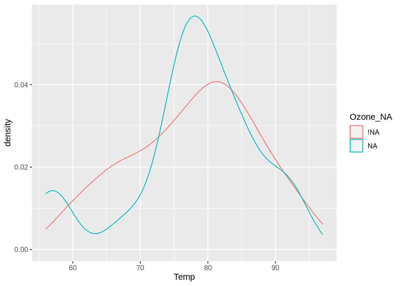
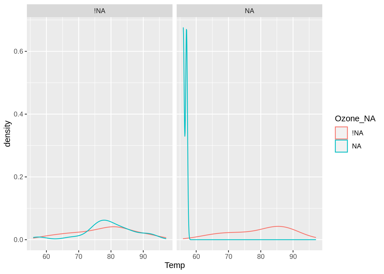
To explore how temperature changes when ozone is missing, we create the nabular data with nabular(), and then add in our aesthetics, colour = Ozone_NA.
This now splits the density into two densities, one for temperature when ozone is present, and one for temperature when ozone is absent. This shows us that the values of temperature don’t change much when ozone is present or absent.
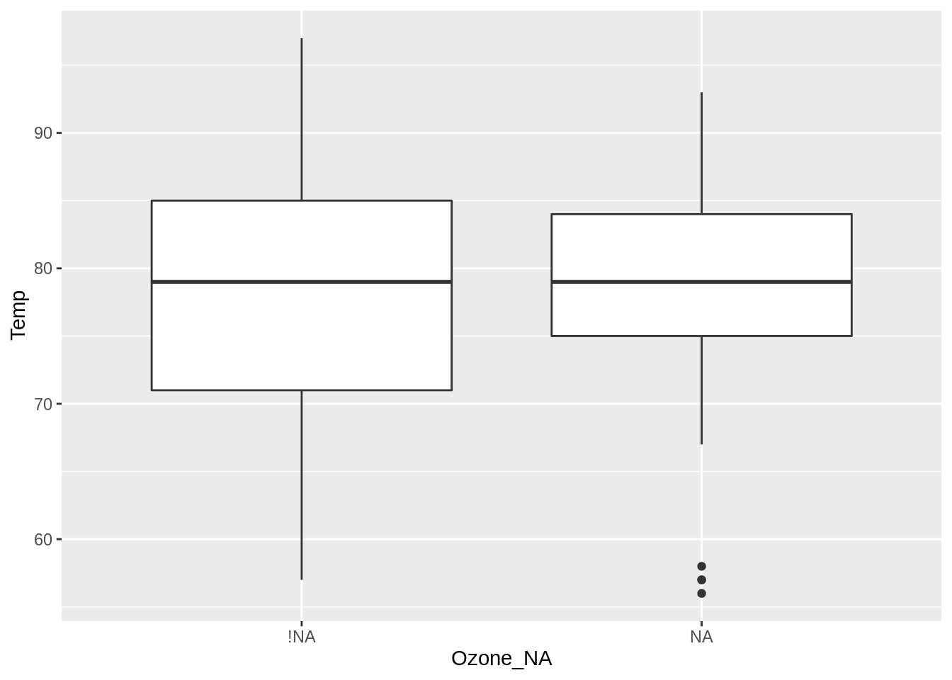
9.2 Visualizing missings using boxplots
Similarly, you can use boxplots to explore missing data, by putting the missingness that you would like to explore by on the x axis (Ozone_NA), and temperature on the y axis, then using geom_boxplot().
What can we learn from this? The values of temperature are similar when ozone is missing versus not missing. However, there is generally less variation for temperature when ozone is missing, but there are also some temperature outliers.
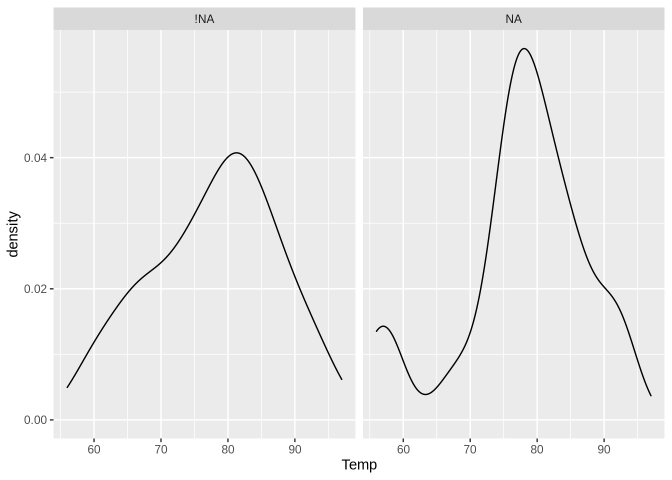
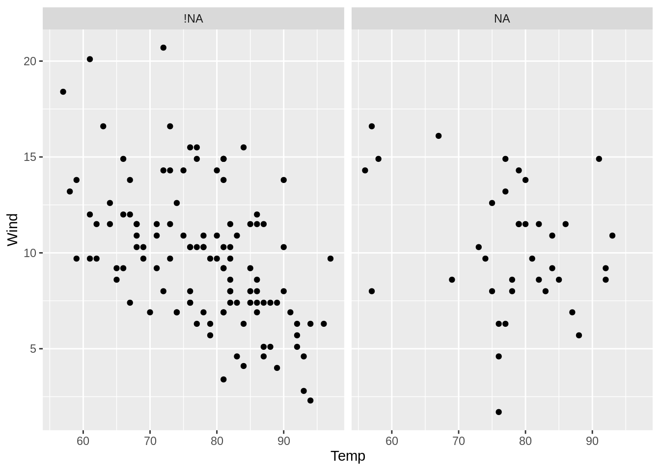
9.3 Visualizing missings using facets
We can visualise two densities for temperature according to the missingness of ozone. This is similar to the previous density visualisation, except the densities are not overlaid, and are faceted - they are in separate plots.
A similar visualisation to the previous visualisation of densities can be made using facets. Here, we use nabular data to create a density plot, using facet_wrap(~Ozone_NA).
Note there are fewer wind and temperature scores when ozone is missing, and that these tend to occur for temperatures over 70 and wind speeds over 5. Overall, the values of wind and temperature when ozone is missing seem similar to when ozone is present.
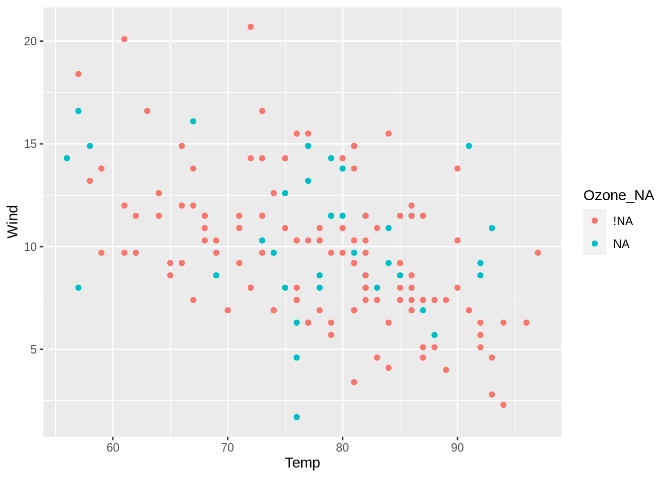
9.4 Visualizing missings using colour
Equivalently to the previous facetted plot, you can visualise the points according to whether they are missing.
This overlays the points rather than creating separate plots. This can sometimes help make comparisons easier, although this is not always the case. In the example above I cannot see any clear pattern in these points.
9.5 Adding layers of missingness
A useful advantage to using facet to split by missings is that this allows you to look at another condition of missingness. For example, create two plots by the missingness of solar radiation, and then colour the densities by missingness of ozone.
This shows us that there isn’t much difference in temperature when solar radiation isn’t missing, but when solar radiation is missing, the temperatures are quite low!
Now that we’ve covered some methods for visually exploring missing data using nabular data and ggplot2, it’s time to practice using this on some other data.